Showing posts with label YELLOW. Show all posts
Showing posts with label YELLOW. Show all posts
Saturday, August 31, 2019


Saturday, August 24, 2019

Sunday, July 21, 2019
"Mixed Posy" by Lynda Cookson
It seems to be the case that orders shipped to South Africa can take up to 3 months to arrive!!! And orders shipped, from France, to Australia, can take more than a month! Sigh ... sadly out of the sender's control :-( This is a little thank you gift sent to a buyer in Australia who had to wait about 6 weeks for "The Big Pink" painting she had ordered to arrive .... here's "Mixed Posy" ...


"Mixed Posy" by Lynda Cookson
Etsy shop for original paintings :
and
Etsy shop for instant downloads of paintings and photographs :
Friday, March 15, 2019
"Red Poppy" by Lynda Cookson
I just put this one up today. The Poppy Collection I did a couple of years ago, whilst working towards a commission painting, remain one of my favourites. They usually pop up where their scarlet petals show up best, in fields of Lavender or Corn. This is what google has to say about what Poppies represent:
"In the spring of 1915, shortly after losing a friend in Ypres, a Canadian doctor, Lieutenant Colonel John McCrae was inspired by the sight of poppies growing in battle-scarred fields to write a now famous poem called 'In Flanders Fields'. After the First World War, the poppy was adopted as a symbol ofRemembrance."
This painting is simply called "Red Poppy" and is a palette knife painting (what else if from me! LOL) on paper, with a white matt board. It's set against a creamy yellow background as if waving around happily in a field of corn.
The unframed measurements are Width 12" by Height 11" (or Width 30 cm x Height 28 cms)
 The original painting if for sale HERE

The original painting if for sale HERE
 The instant digital download is available HERE
 The instant digital download is available HERE
"In the spring of 1915, shortly after losing a friend in Ypres, a Canadian doctor, Lieutenant Colonel John McCrae was inspired by the sight of poppies growing in battle-scarred fields to write a now famous poem called 'In Flanders Fields'. After the First World War, the poppy was adopted as a symbol ofRemembrance."
This painting is simply called "Red Poppy" and is a palette knife painting (what else if from me! LOL) on paper, with a white matt board. It's set against a creamy yellow background as if waving around happily in a field of corn.
The unframed measurements are Width 12" by Height 11" (or Width 30 cm x Height 28 cms)
and
The original painting if for sale HERE
~~~~~~~~~~~~~~~~~~~~~~~~~~~~~
or join us on Facebook here
Saturday, August 11, 2018
"Yellow Cottage" by Paula Formanek
What's on my Easel??
I just added a few small touches and signed this one. if you are from the Kingston area you likely have seen this place.
'Yellow Cottage', oil with knife on panel, 31 x 41 cm ... painted on location near the Kingston Mills Locks last summer ...
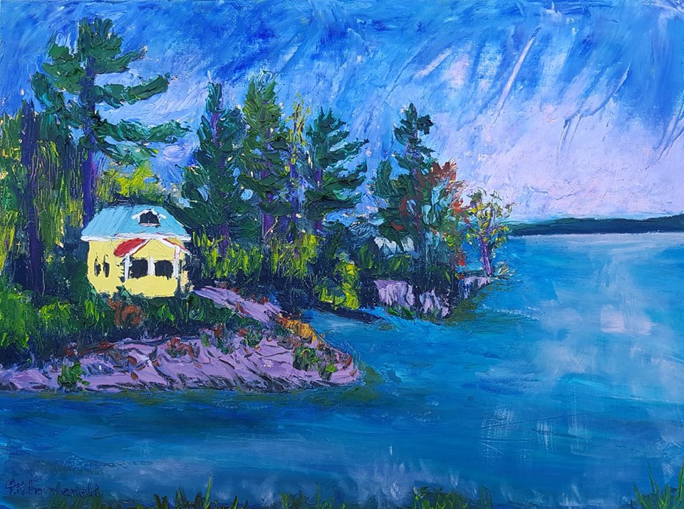
"Yellow Cottage" by Paula Formanek
Friday, July 27, 2018
"Lilacs" by Judy Mackey
Drying on my easel today.
I hadn't painted large in a long while so it felt good to just go free and paint with tons of paint. This canvas had been toned pink for another painting I had in mind but as I starred at the pink for months, actually, I decided - nope! It has to be a soft yellow/ochre...I think it sets the purples of the flowers really well.
"Lilacs"
24 x 24 x 1.5 inches, Oil on Canvas

I hadn't painted large in a long while so it felt good to just go free and paint with tons of paint. This canvas had been toned pink for another painting I had in mind but as I starred at the pink for months, actually, I decided - nope! It has to be a soft yellow/ochre...I think it sets the purples of the flowers really well.
"Lilacs"
24 x 24 x 1.5 inches, Oil on Canvas

"Lilacs" by Judy Mackey
Thursday, July 19, 2018
Floral Still Life by Judy Mackey
A stunning floral still life by our July featured artist .... Judy Mackey


Floral arrangement by Judy Mackey
Thursday, July 5, 2018
Floral Painting by Carrie Jacobson
I’ll have this new beauty at the Wickford, RI, Fine Art Festival, Saturday and Sunday. Look for me on Elam Street!


Painter : Carrie Jacobson
Monday, March 26, 2018
"Hot Lands" by Lynda Cookson
I wonder, does anyone else see the days of the week in colour? I always have and somehow thought everyone else would too ... but it would seem not!
This is what I see when you say a day of the week to me:
Monday BLUE sometimes WHITE (mood related?)
Tuesday GREEN
Wednesday ORANGE
Thursday PURPLE
Friday A LIVELY BLUE GREY
Saturday CAMEL / BEIGE
Sunday YELLOW
Anyway, it feels like Sunday today, although it's Monday, so I'm choosing a yellowy abstract which makes me think of Sunday and my country of South Africa.
"Hot Lands"
Oil and Mixed Media on Paper
8.25" x 11.75"

This is what I see when you say a day of the week to me:
Monday BLUE sometimes WHITE (mood related?)
Tuesday GREEN
Wednesday ORANGE
Thursday PURPLE
Friday A LIVELY BLUE GREY
Saturday CAMEL / BEIGE
Sunday YELLOW
Anyway, it feels like Sunday today, although it's Monday, so I'm choosing a yellowy abstract which makes me think of Sunday and my country of South Africa.
"Hot Lands"
Oil and Mixed Media on Paper
8.25" x 11.75"

"Hot Lands" by Lynda Cookson
My art website : https://lyndacookson.blogspot.fr/
The ePlan website : https://onlinepresenceassistant.blogspot.fr/
Thursday, March 8, 2018
"Impact" by Lynda Cookson
Another abstract study to help me with The Big Painting.
Painting no. 28 in the 30 Paintings in 30 Days Challenge
"Impact"
Oil on Paper
7.5" x 11" (19 cm x 28 cm)

Painting no. 28 in the 30 Paintings in 30 Days Challenge
"Impact"
Oil on Paper
7.5" x 11" (19 cm x 28 cm)

"Impact" by Lynda Cookson
Wednesday, February 28, 2018
"Pals for Tea" by Lynda Cookson
I often keep surfaces (paper, board or canvas) from failed paintings and clean my palette knife on them ... or fill them with palette knife strokes of left-over paint. They make interesting backgrounds and props for simple, warm-up paintings. Here's one of them:
Painting no. 21 in the 30 Paintings in 30 Days Challenge
"Pals for Tea"
Oil on Board
4.5" x 6" (12 cm x 16 cm)

Painting no. 21 in the 30 Paintings in 30 Days Challenge
"Pals for Tea"
Oil on Board
4.5" x 6" (12 cm x 16 cm)
Price : €35 plus €12 shipping

"Pals for Tea" by Lynda Cookson
All the paintings in the 30 Paintings in 30 Days Challenge are for sale here:
My website : http://lyndacookson.blogspot.fr/p/30-paintings-in-30-days-challenge.html
Friday, February 23, 2018
"Tall Pot of Geraniums" by Lynda Cookson
Painting No. 16 in the 30 Paintings in 30 Days Challenge
"Tall Pot of Geraniums"
Watercolour on Paper
11" x 7" (28 cm x 18 cm) approx.

"Tall Pot of Geraniums"
Watercolour on Paper
11" x 7" (28 cm x 18 cm) approx.

"Tall Pot of Geraniums" by Lynda Cookson
My website : http://lyndacookson.blogspot.fr
Friday, February 16, 2018
"Birthday Bouquet" by Lynda Cookson
Painting no. 11 in the 30 Paintings in 30 Days Challenge
"Birthday Bouquet"
Oil on Paper
5" x 7.5" (13 cm x 19 cm)

"Birthday Bouquet"
Oil on Paper
5" x 7.5" (13 cm x 19 cm)

"Birthday Bouquet" by Lynda Cookson
My website : http://lyndacookson.blogspot.fr
Sunday, September 3, 2017
Blasted my painting mojo back into place this morning with a bit of vigour.
I absolutely LOVE abstract work ... it's exciting, unpredictable (love that bit!), constantly holds your attention and tickles your imagination with just the biggest feather! Plus more, but I'm too excited to think of the correct words right now.
Perhaps enthusiasm is the right word ... abstract can make my enthusiasm simply burst!
So lovely to be back painting.
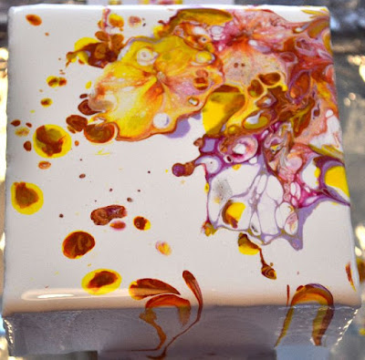


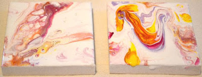
I absolutely LOVE abstract work ... it's exciting, unpredictable (love that bit!), constantly holds your attention and tickles your imagination with just the biggest feather! Plus more, but I'm too excited to think of the correct words right now.
Perhaps enthusiasm is the right word ... abstract can make my enthusiasm simply burst!
So lovely to be back painting.


Wednesday, November 9, 2016
Stackable Chairs by NY artist, Celeste Plowden

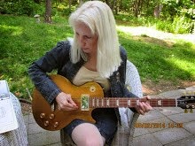 I learned the art of acrylic and pastel painting through private instruction, after having spent my career as a designer of printed fabrics in the New York market place. I am a graduate of the College of Design, Art and Architecture at the University of Cincinnati, with a major in the History of Art, 1977. Later, I studied printed textile design at Parsons School of Design, in New York. Immediately afterward, I began free lance work for several design studios in the garment district of NYC, where I did re-coloration work for printed apparel fabrics, and sold my own designs through Bread and Butter Designs,also located in New York. In addition, during the 1980's and 1990's, I designed a number of needlecraft and stencil books for Dover Publications. Currently, I am working on a series of exotic birds and other animals done in acrylic paint, with a palette knife, for texture and brilliant color. I consider my paintings to be representational or impressionistic in nature, and I use fantasy colors because what I see often makes me feel these colors,and what would make an interesting composition, rather than using realistic colors.
Thursday, October 27, 2016
Lemon Still Life, by NY artist, Celeste Plowden
 I learned the art of acrylic and pastel painting through private instruction, after having spent my career as a designer of printed fabrics in the New York market place. I am a graduate of the College of Design, Art and Architecture at the University of Cincinnati, with a major in the History of Art, 1977. Later, I studied printed textile design at Parsons School of Design, in New York. Immediately afterward, I began free lance work for several design studios in the garment district of NYC, where I did re-coloration work for printed apparel fabrics, and sold my own designs through Bread and Butter Designs,also located in New York. In addition, during the 1980's and 1990's, I designed a number of needlecraft and stencil books for Dover Publications. Currently, I am working on a series of exotic birds and other animals done in acrylic paint, with a palette knife, for texture and brilliant color. I consider my paintings to be representational or impressionistic in nature, and I use fantasy colors because what I see often makes me feel these colors,and what would make an interesting composition, rather than using realistic colors.
Tuesday, October 11, 2016
What are your Favourite Colour Combinations? by Marion Hedger
My friend, artist Sea Dean, posed the question "If you had to choose just two colors what would they be and why?" But it was not as simple as saying blue and yellow, of course she wanted more detail - exactly what shades, which brand etc.
This got me thinking. I use a lot of colour in my paintings but my palette has evolved to always having cadmium yellow medium, ultramarine blue, winsor blue, dioxazine violet and alazarin crimson and often viridian squeezed onto the palette. These basic colours provide me with combinations that suit the Provence landscape. I add yellow ochre pale for some buildings, rocks and pathways and also use other colours as required. I use winsor and Newton oil paints as the consistency is right for me for both palette knife and brush.
I can't say that I have two favourites but there are certain combinations I love and here are two:
Pale purple and green/turquoise
This painting is based on the shimmering combination of the violet and turquoise

For the pale purple I mix diox purple with white, sometimes adding a touch of pink (permanent rose or al. crimson with white) or a touch of pale winsor blue depending upon the temperature I am trying to achieve. For the green turquoise I will mix a combination of phthalo blue, lemon yellow, white and often viridian and winsor blue to get the correct colour.
Yellow and purple
This combination is difficult to pull off because they are both such vibrant colours. It is important to make one of them more dominant than the other. In this painting the purple dominates but the yellow is the star

Of course the yellow doesn't need to be vibrant, the combination works just as well with purple and yellow ochre

This got me thinking. I use a lot of colour in my paintings but my palette has evolved to always having cadmium yellow medium, ultramarine blue, winsor blue, dioxazine violet and alazarin crimson and often viridian squeezed onto the palette. These basic colours provide me with combinations that suit the Provence landscape. I add yellow ochre pale for some buildings, rocks and pathways and also use other colours as required. I use winsor and Newton oil paints as the consistency is right for me for both palette knife and brush.
I can't say that I have two favourites but there are certain combinations I love and here are two:
Pale purple and green/turquoise
This painting is based on the shimmering combination of the violet and turquoise

For the pale purple I mix diox purple with white, sometimes adding a touch of pink (permanent rose or al. crimson with white) or a touch of pale winsor blue depending upon the temperature I am trying to achieve. For the green turquoise I will mix a combination of phthalo blue, lemon yellow, white and often viridian and winsor blue to get the correct colour.
Yellow and purple
This combination is difficult to pull off because they are both such vibrant colours. It is important to make one of them more dominant than the other. In this painting the purple dominates but the yellow is the star

Of course the yellow doesn't need to be vibrant, the combination works just as well with purple and yellow ochre

Saturday, August 27, 2016
"Red Poppy" by Lynda Cookson
I'm on a roll with the Red Poppies! This one, oil on paper, is for sale HERE or click the images or their titles.
All my art for sale can be accessed from : http://WildSummers.com


All my art for sale can be accessed from : http://WildSummers.com
Wednesday, August 24, 2016
Sweet Spring, by NY artist, Celeste Plowden
 I learned the art of acrylic and pastel painting through private instruction, after having spent my career as a designer of printed fabrics in the New York market place. I am a graduate of the College of Design, Art and Architecture at the University of Cincinnati, with a major in the History of Art, 1977. Later, I studied printed textile design at Parsons School of Design, in New York. Immediately afterward, I began free lance work for several design studios in the garment district of NYC, where I did re-coloration work for printed apparel fabrics, and sold my own designs through Bread and Butter Designs,also located in New York. In addition, during the 1980's and 1990's, I designed a number of needlecraft and stencil books for Dover Publications. Currently, I am working on a series of exotic birds and other animals done in acrylic paint, with a palette knife, for texture and brilliant color. I consider my paintings to be representational or impressionistic in nature, and I use fantasy colors because what I see often makes me feel these colors,and what would make an interesting composition, rather than using realistic colors.
Subscribe to:
Posts (Atom)
